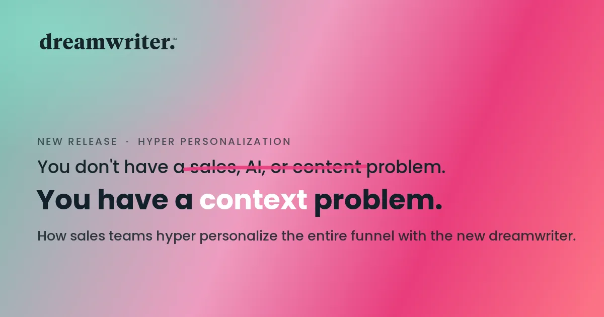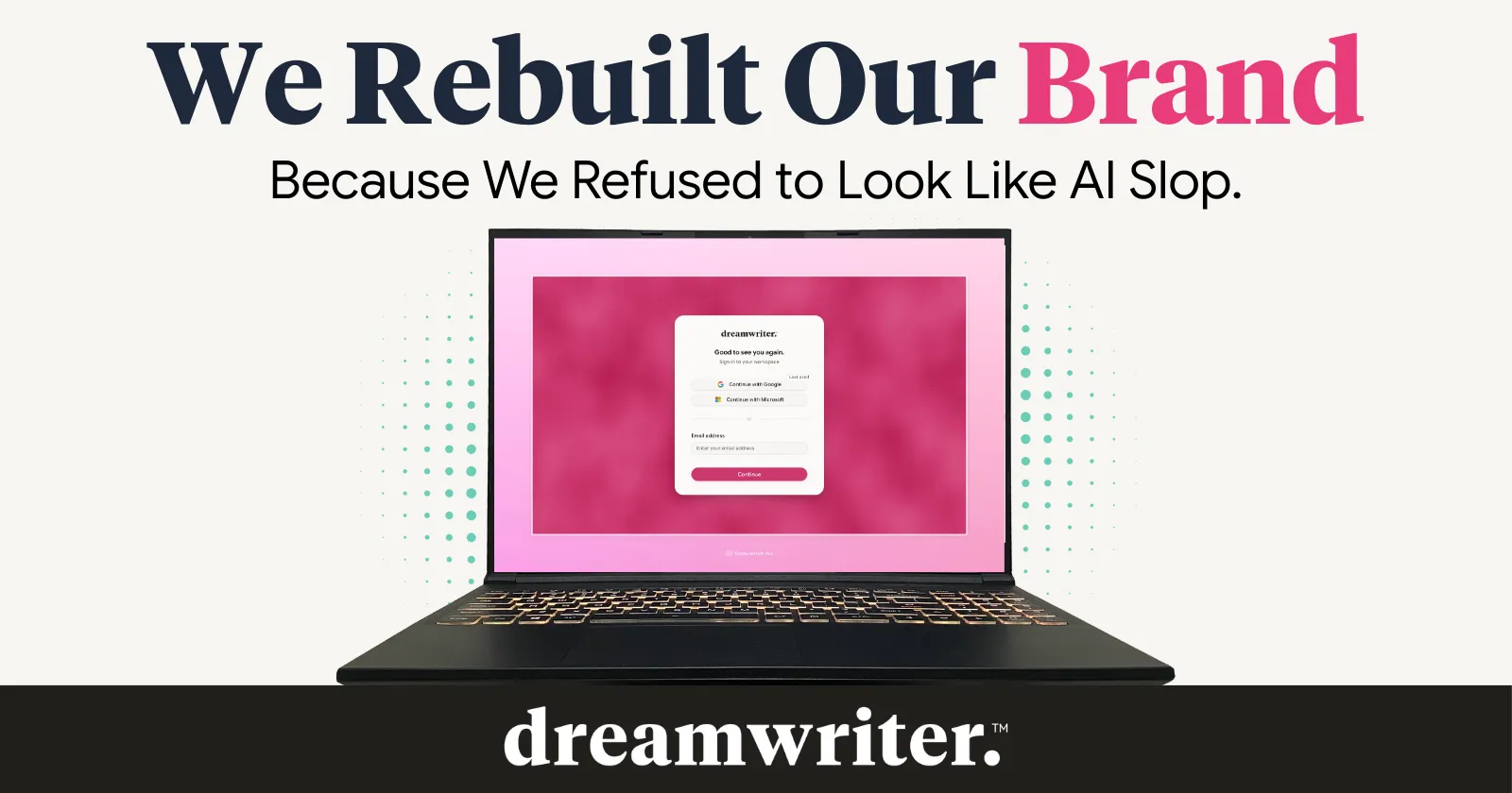
We Rebuilt Our Brand Because We Refused to Look Like AI Slop
Open any AI product’s landing page right now. Go ahead, pick one.
Blue-purple gradient. Geometric sans-serif. Glowing orbs floating in a dark void. Maybe a little particle animation if they’re feeling fancy. You’ve seen it a hundred times. You’ll see it a hundred more before lunch.
Brands flocking to a design trend screams hijacking of credibility.
Over the past year, AI companies have converged on a single visual language so thoroughly that buyers can’t tell them apart. And it’s not just our observation. Mentions of “AI slop” increased 9x in 2025 compared to 2024, with negative sentiment peaking at 54% by October.¹ Researchers now describe the phenomenon as a kind of visual conformity, millions of companies using the same tools, arriving at the same glossy, interchangeable output.² More than half of all new English-language articles on the web are now AI-generated.³ The content is blending together. The products look the same. And buyers, especially the sharp ones who actually sign contracts, are starting to notice.
We know how this happened. And we know because it happened to us.
How We Ended Up in the Uniform
When Dreamwriter launched in 2023, we chose a creative, empowering visual identity. Blue-purple gradients. Clean lines. Warm, expressive, intentional. At the time, it was a genuine design choice, not a symptom of anything. Every design was made by a human. Every line of code was written by a human. The product itself uses AI to generate content for our customers, but the product was never vibecoded.
Then vibecoding happened. Bolt.new and Lovable exploded in late 2024 and into 2025, letting anyone spin up a landing page with a prompt. Millions of sites got built on the same frameworks, the same Tailwind defaults, the same aesthetic DNA. The blue-purple gradient went from a design choice to a tell. And suddenly our brand, which predated all of it, looked like it had come out of the same machine.
We didn’t follow a trend. The trend swallowed us whole.
We started getting compared to Canva. To Gamma. To GenSpark. None of them do what we do. Dreamwriter creates hyper-personalized GTM collateral at scale. Fully designed assets, in your brand voice, mapped to specific buyer pain points. That’s not a template engine. That’s not a design tool. That’s a fundamentally different product.
But the visual shorthand was doing the talking for us. And it was saying the wrong thing.
The Decision
We could have done nothing. Plenty of startups would have. Rebranding at this stage sounds like a luxury, time and money you could spend shipping features, running campaigns, closing deals. Some advisors told us exactly that.
But here’s what they didn’t account for: in a market flooded with samey AI tools and samey AI aesthetics, looking generic is itself a cost. It’s the deals you don’t get because a VP of Marketing glanced at your site and mentally filed you in the “yet another AI tool” drawer. It’s the warm intro that goes cold because your brand doesn’t match the sophistication of your product. Those costs are invisible, which makes them easy to ignore. We decided to stop ignoring them.
So after nearly three years, we made the call. Tear it down. Not because the old brand was bad. It served us well when we were finding our footing. But it had become invisible. It didn’t reflect who we’d become or signal where we were headed.
What We Built
The new Dreamwriter runs on raspberry, mint, and stone. If those sound unusual for a B2B SaaS company, that’s the point.
Nobody in this space owns these colors. Walk through the exhibit hall at SaaStr or scroll through your LinkedIn feed and you’ll see every shade of blue, purple, and electric cyan imaginable. You will not see raspberry. That was the first filter: could we pick this brand out of a lineup? If the answer was yes before we’d even read the name, we were on the right track.
Google Sans Flex became our typeface. Google only open-sourced it in December 2025, and we jumped on it immediately. It’s one of the most flexible fonts ever released, designed to adapt across weights, sizes, and contexts in a way that makes interfaces feel more human. We think it’s going to be the next Inter. We wanted to be early.
The overall direction shifted from dazzle to authority. The old brand tried to impress you. The new brand tries to earn your trust. That distinction matters more than most people realize. When Aerie pledged last October to never use AI-generated imagery, that single Instagram post became their highest-performing content of the month, a 2.49% engagement rate, roughly $519,000 in earned media value.⁴ The market is rewarding brands that take a clear stance against the visual sameness. We took note.
Why Every Choice Was a Disassociation
Here’s what we kept coming back to during the process: we’re not building a design tool. We’re not a template engine. We’re a marketing intelligence platform for revenue teams who need to move fast without sacrificing quality.
Every design decision was filtered through one question: does this make us look like what we actually are?
Raspberry over purple, because warmth and authority beat hype. Mint over electric blue, because we wanted to feel approachable, not clinical. Stone over stark white, because we’re grounded in real GTM workflows, not floating in abstract AI space.
The goal wasn’t to be different for its own sake. It was to stop being invisible. The typography choice reflects the same thinking. Google Sans Flex was open-sourced weeks before we finalized the rebrand. It’s built for the kind of flexibility that makes UI feel human, not templated. Adopting it early is a small bet, but it’s the kind of bet we like making.
The best rebrands aren’t design projects. They’re strategic declarations. Vercel used theirs to signal a bet on the future of frontend development.⁵ Bettermode used theirs to articulate how they’d outgrown their original product category.⁶ Ours is a declaration too: we take the craft of GTM as seriously as we take the technology behind it. We’re building something that belongs in the stack of revenue teams doing $50M+ in pipeline. And now we look like it.
What This Is Really About
There’s a broader thing happening that goes beyond our brand or our company.
The first generation of AI products competed on novelty. “Look what AI can do” was enough to get attention, get downloads, get funding. The aesthetic matched the pitch: futuristic, shiny, promissory.
That era is ending. Buyers have been burned. They’ve sat through demos that dazzled and products that disappointed. They’ve adopted tools that generated volume but not quality, speed but not relevance. The backlash isn’t a blip. It’s a correction. When even mainstream publications like Scientific American are running pieces on how AI-generated sameness is eroding trust,⁷ you know the conversation has moved past early adopters.
The next generation of AI products will compete on substance. On outcomes. On whether the thing actually works for the people it claims to serve. We believe the brands that win this next phase will be the ones that look like they have nothing to hide. Because they don’t.
That’s how we operate. Our designs are still made by humans. Our engineers use AI-assisted and agentic workflows to move faster, but every decision, every review, every detail goes through a human. We adopted AI-assisted development in 2024 to improve our cycle time, and today our team experiments constantly with new tools and workflows. But the human is always in the loop. That’s not a limitation. It’s the product philosophy.
Where We Go From Here
The rebrand is the visible part. There’s a lot happening underneath.
We’re deepening our integrations with the workflows GTM teams actually use. We’re expanding what hyper-personalization means at the campaign level, not just emails and one-pagers, but the full collateral lifecycle that follows a deal from first touch to close. And we’re doing it with the same intentionality we brought to this brand: every decision deliberate, every detail in service of the people who use the product.
We’re early-stage. We look like we’ve been doing this for years. That’s not an accident. It’s a signal of how we operate.
Same name. Different energy. Let’s get to work.
¹ Meltwater, “What the Rise of AI Slop Means for Marketers,” December 2025.
² Smith, N. & Southerton, C., “AI and Aesthetic Alienation: The Image and Creativity in Contemporary Culture,” Social Science Computer Review, 2026.
³ Graphite, “More Articles Are Now Created by AI Than Humans,” October 2025. Study analyzed 65,000 English-language articles from Common Crawl, published between January 2020 and May 2025.
⁴ Meltwater, “What the Rise of AI Slop Means for Marketers,” December 2025. Aerie’s October 9, 2025 Instagram post announcing its “no AI-generated bodies or people” commitment.
⁵ ZEIT rebranded to Vercel in April 2020, tying the name change to the company’s vision for the future of frontend development and developer experience.
⁶ Bettermode (formerly Tribe), “Introducing Bettermode,” 2023. The rebrand reflected the platform’s expansion from a community tool to an all-in-one customer engagement hub.
⁷ Scientific American, “AI Slop — How Every Media Revolution Breeds Rubbish and Art,” November 2025.